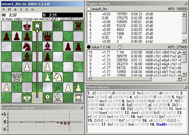
Seems to me that the chess fonts are of a poor quality in your picture?
I have the same problem with the new Arena 2, in my older comps, the chess fonts are poor although they are okey when installed in my somewhat newer computers.
This is not the case whit Arena beta 1.99 beta 5. Everything is fine with the fonts there. Your thoughts?
It looks like your Arena is polished with a winboard paint
_No one can hit as hard as life.But it ain’t about how hard you can hit.It’s about how hard you can get hit and keep moving forward.How much you can take and keep moving forward….
Yes, I noticed the piece font problem too. The pieces in the screendump are the built-in piece set which looks best for me, in 2.0 (I forgot to activate the shadow which makes it look better).
But I found that the display of external truetype piece fonts is not like it was in Arena 1.1, where it looked perfect. I think the TT. piece font antialiasing does not work with version 2.0 (at least not in Vista + GeForce graphics).
Here are screendumps of Arena 1.1 with Fritz fonts, in Vista on the same computer. That is how the pieces should look like.
Minor Tweaks, that all I did it was already a nicely done product.
Clocks
Chess Piece Fonts
Sounds
Player Names
"Good decisions come from experience, and experience comes from bad decisions."
__________________________________________________________________
Ted Summers
Karmazen & Oliver wrote:
I test now and THE NEW version is more fast, more stable, more looking is a lof of MORE ¡
it´s a fantastic GUI chess, I think that is the GUI more configurable in the world, where you can change a lot ot options to do a "human" gui... it´s fantastic in ALL his options ¡¡¡
arena have free support for *.pgn, epds, copy information, printing, support too for DGT boards, for Novag Citrine and other "compatibleS" serials in configuration... ¡¡ support too for ICS ¡¡ support book too ¡ and show a lot of information in the window ¡
good work for all people that colaborate with ARENA CHESS GUI ¡


